Das Bild ist nicht mehr verfügbar – Painting not available anymore
Blick auf den Berliner Dom (Aquarell, Bütten, Centenaire, Feinkorn – 31cm x 41cm) Die Webseite zum Berliner Dom finden Sie hier.
Wir haben über 1600 Brücken in Berlin… und manchmal wunderschöne Sonnenuntergänge… und (ab und zu) träumen wir von Venedig.
Adolf Glasbrenner (1810-1876): „Ich liebe Dir! ich liebe Dich! Wie’s richtig is, ich weeß es nich, Un’s is mich auch Pomade!“
View towards the Berlin Dome (Watercolor, on mould-made paper, Centenaire grain fin – 11,9in x 15,8in) You can find the homepage of the Berlin Dome here.
We have over 1600 bridges in Berlin… and sometimes beautiful sunsets… and ( occasionally ) we dream of Venice.
Das Bild ist nicht mehr verfügbar – Painting not available anymore
Die Welle ins Leben der 2020er Möge Euch diese Welle zu schönen und zum Teil ja vielleicht auch neuen besseren Ufern tragen. (Acryl auf mehrfach grundierter 100 % Canvas-Baumwolle [380g/m²] auf Holz-Keilrahmen, 50cm x 100cm)
The wave into the life of the 2020s May this wave carry you to beautiful and sometimes even new better shores. (Acrylics on 100% cotton canvas [380gsm] multiple primed on wooden frame – 19,6in x 27,5in)
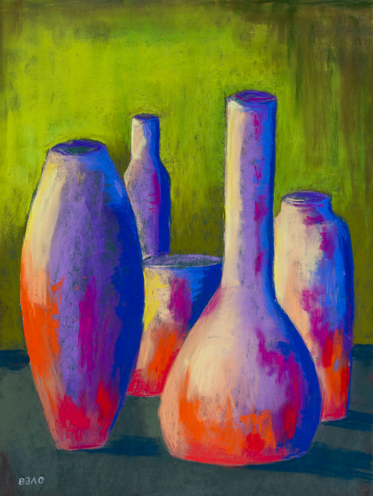
Giorgio Morandi ungezügelt (Pastell auf Pastelmat® – 40cm x 30cm)
Die Arbeiten Morandis zum Thema beeindrucken mich tief. Sie regen an, seinen Wegen zu folgen, aber auch, diese zu verlassen und eigenes Sehen und Verarbeiten einzubringen. Bei mir ist es immer wieder die Faszination der Farben, die Spezifität der Pigmente und ihr Verhalten zueinander. So entstand dieses farblich heftig wilde und dennoch in sich ruhende Stillleben.
Giorgio Morandi goes wild (Pastel on Pastelmat® – 15,7in x 11,8in)
I am deeply impressed by Morandi’s paintings on the subject. They encourage me to follow his paths, but also to leave them and to bring in my own seeing and processing. For me it is always the fascination of colours, the specificity of pigments and their behaviour towards each other. This is how this wildly colourful yet still life came into being.
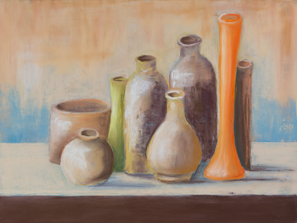
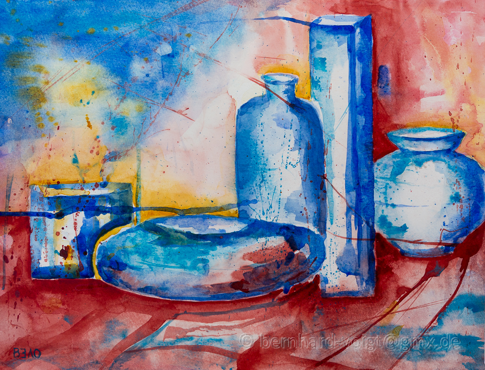
Stillleben – Hommage an Giorgio Morandi (Pastell auf Pastelmat®, 30cm x 40cm)
Giorgio Morandi gehört zweifellos zu den bedeutendsten Stilllebenmalern. Er experimentierte insbesondere mit Flächigkeit und Räumlichkeit. So vermochte er es, einfachen Dingen Geheimnisvolles und Würde zu verleihen. In vielen Arbeiten widmete er sich den Utensilien des Alltags. Sein besonderes Augenmerk fiel immer wieder auf Flaschen, Krüge, Pötte, Tassen, Vasen, Näpfe, Dosen usw. Mir bereitet der Ausflug in seine Welt Freude, verleiht sie doch durch die ihr innewohnende Stille, die reine Beobachtung von Form und Licht eine ganz besondere Achtsamkeit beim Malen. Bewusst wählte ich dafür die Pastellmalerei, um Zartheit und Stofflichkeit herauszuarbeiten und zu unterstützen. Mit der Pastellkreide in der Hand kann man die Objekte nahezu (er)fühlen.
Still Life – Homage to Giorgio Morandi (Pastels on Pastelmat® – 11,8in x 15,7in))
Giorgio Morandi is undoubtedly one of the most important still life painters. He experimented in particular with area and space. Thus he was able to lend mystery and elegance to simple things. In many of his works he devoted himself to the utensils of everyday life. His special attention was always on bottles, jugs, pots, cups, vases, bowls, cans, etc.. The excursion into his world gives me pleasure, because the silence inherent in it, the pure observation of shape and light, gives it a very special attention when painting. I deliberately chose pastel painting to emphasize and support tenderness and materiality. With the pastel chalk in your hand you can almost feel the objects.
Das Bild ist nicht mehr verfügbar – Painting not available anymore
Stürmische Ostsee bei schwerem Himmel Acryl auf Canvas-Baumwolle [380g/m²] auf Holz-Keilrahmen, 50cm x 70cm)
Das Meer, die Luft und der Himmel – das gesamte Klima, die schier unendlich erscheinende Weite des Wassers und ihre Wirkungen auf mich, empfinde ich stets als sehr angenehm. Dazu das Erleben von Flut und Ebbe, von sich oft schnell und überraschend ändernden Witterungserscheinungen, lassen mich gern eins werden mit dem Geschehen und hinterlassen tiefe Eindrücke. Die Macht der Naturgewalten Licht, Wind und Wasser lassen oft einzigartig wunderbare Situationen entstehen. Eine solche inspirierte mich zum Malen des aktuellen Bildes.
Stormy Baltic Sea in a heavy sky (Acrylics – 19,6in x 27,5in)
The ocean, the air and the sky – the entire climate, the seemingly endless expanse of water and its effects on me, I always find very pleasant. In addition, the experience of high and low tide, of weather phenomena that often change quickly and surprisingly, let me be a part of the action and leave deep impressions. The power of the elements light, wind and water often create unique and wonderful situations. Such a scene inspired me to create the current painting.
Die Bilder sind nicht mehr verfügbar – Paintings not available anymore
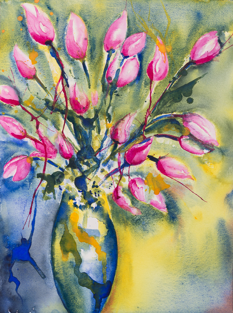
Heute eine kleine Auswahl an Postkarten mit Frühlingsblumen. Die Jahreszeit lässt uns von frischen Farben und buntem Treiben träumen. — Today a small selection of postcards with spring flowers. The season makes us dream of fresh colours and a vibrant hustle and bustle.
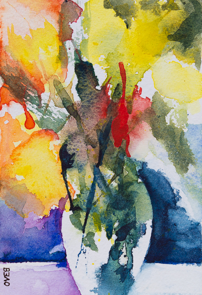
Spring Flower Boquet 2019
Water colour paper 300g/m² – 140lb/m² 10cm x 15cm / 4in x 6in
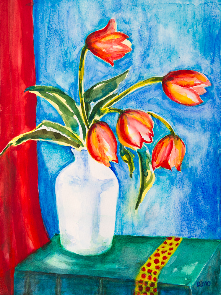
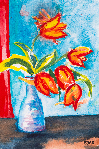
Yellow-Red tulips in Spring 2019 I
Eine kleine Hommage in Aquarellfarben an den Künstler August Macke. — A little tribute in watercolour paints to artist August Macke. — Water colour paper 300g/m² – 140lb/m², 10cm x 15cm / 4in x 6in
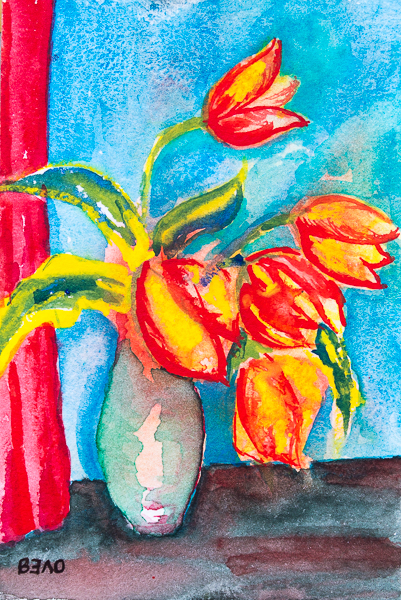
Yellow-Red tulips in Spring 2019 II
Eine kleine Hommage in Aquarellfarben an den Künstler August Macke. — A little tribute in watercolour paints to artist August Macke. — Water colour paper 300g/m² – 140lb/m², 10cm x 15cm / 4in x 6in
Yellow-Red tulips in Spring 2019 III
Eine kleine Hommage in Aquarellfarben an den Künstler August Macke. — A little tribute in watercolour paints to artist August Macke. — Water colour paper 300g/m² – 140lb/m², 10cm x 15cm / 4in x 6in
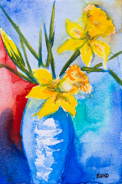
Daffodils in Springtime 2019 I
Water colour paper 300g/m² – 140lb/m² 10cm x 15cm / 4in x 6in
Daffodils in Springtime 2019 II
Water colour paper 300g/m² – 140lb/m² 10cm x 15cm / 4in x 6in
Violet & yellow tulips in Spring 2019
Water colour paper 300g/m² – 140lb/m² 10cm x 15cm / 4in x 6in
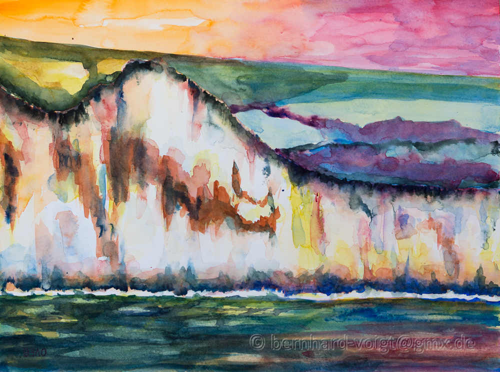
Küste von Dover IV – Coast off Dover IV
Küste von Dover IV
Aquarell, 56cm x 76cm, Bütten, 640g/m²
Coast off Dover IV
Watercolor, 22in x 30in, mould made, 300lb/m²